Xend Finance - A Crypto Currency Bank
How we increase user acquisition through the redesign of Xend finance
mobile app
Background
Xend Finance is a global Crypto Platform, with an open Web3 infrastructure. Xend Finance is using the power of
decentralised finance (DeFi) to build a digital bank. Xend aimed to evolve from a simple wallet app with over 500,000
users into a full digital bank powered by crypto.
My Role
The Impact
Understanding the Problem
To understand the reason why we are redesigning the existing platform, I spoke with the various stakeholders and below are the challenges i was able to uncover.
The engineering team: The team needed a redesign that maintained the existing code architecture due to limited time and increasing code complexity.
The business stakeholders: This team prioritised timely delivery without compromising requirements, but the heavy engineering workload and frequent requests created bottlenecks that affected turnaround time.
Data from analytics tools: This shoes that key business issue is the "lengthy process," which accounts for 26.2% of support tickets. Analytics reveal that 27% of users drop off during onboarding and 18% abandon the app during the funding process.
How do our user feel?
Design Approach
Before diving into design i proposed solution on how to achieve this redesign, collaborate with PMS to set up KPI to measure the success of this redesign
The Goal of the Projects includes
Design a new refresh of the current app that is intuitive and easy to sign up.
A seamless verification process that doesn’t interfere with app usage.
An app that enables users to complete basic tasks with ease and without feeling overwhelmed.
Enhance the user experience by enabling users to perform task and increase Task Completion Rate.
What did we ship
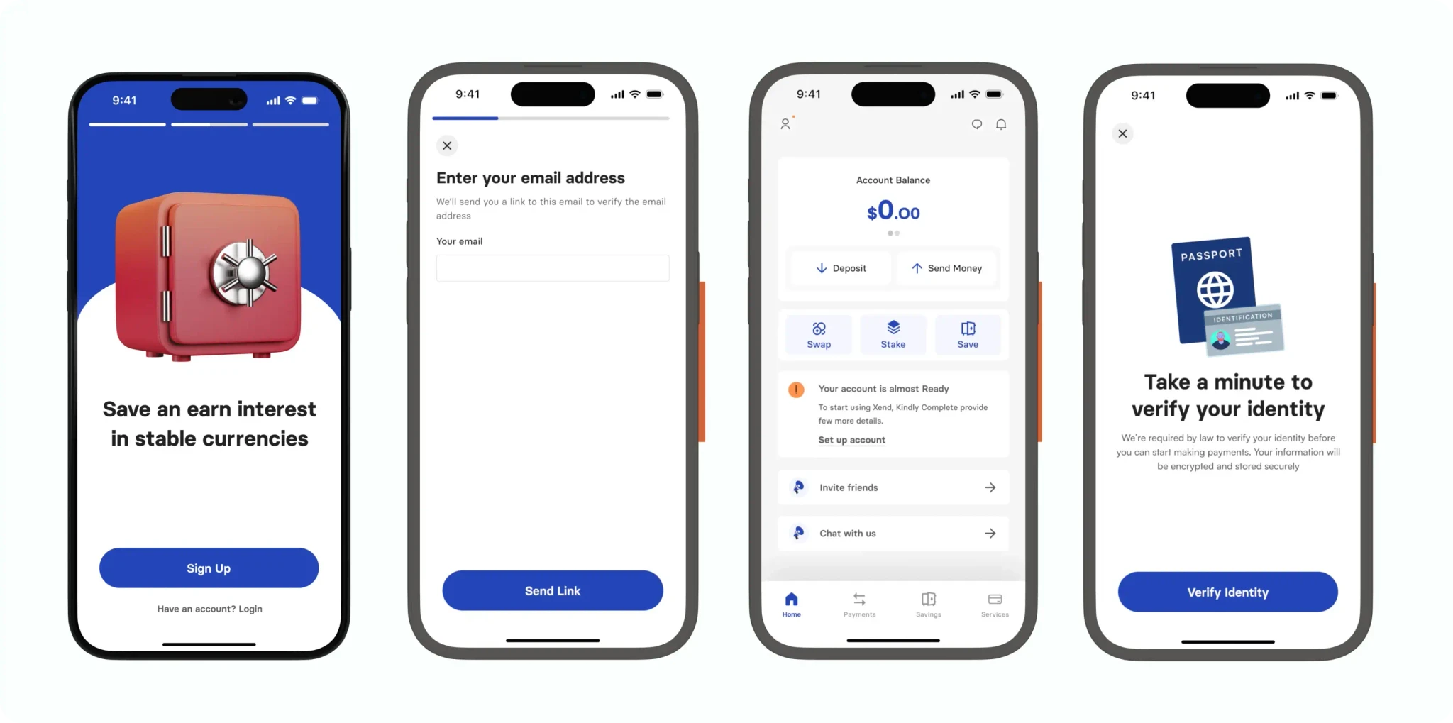
Before redesign
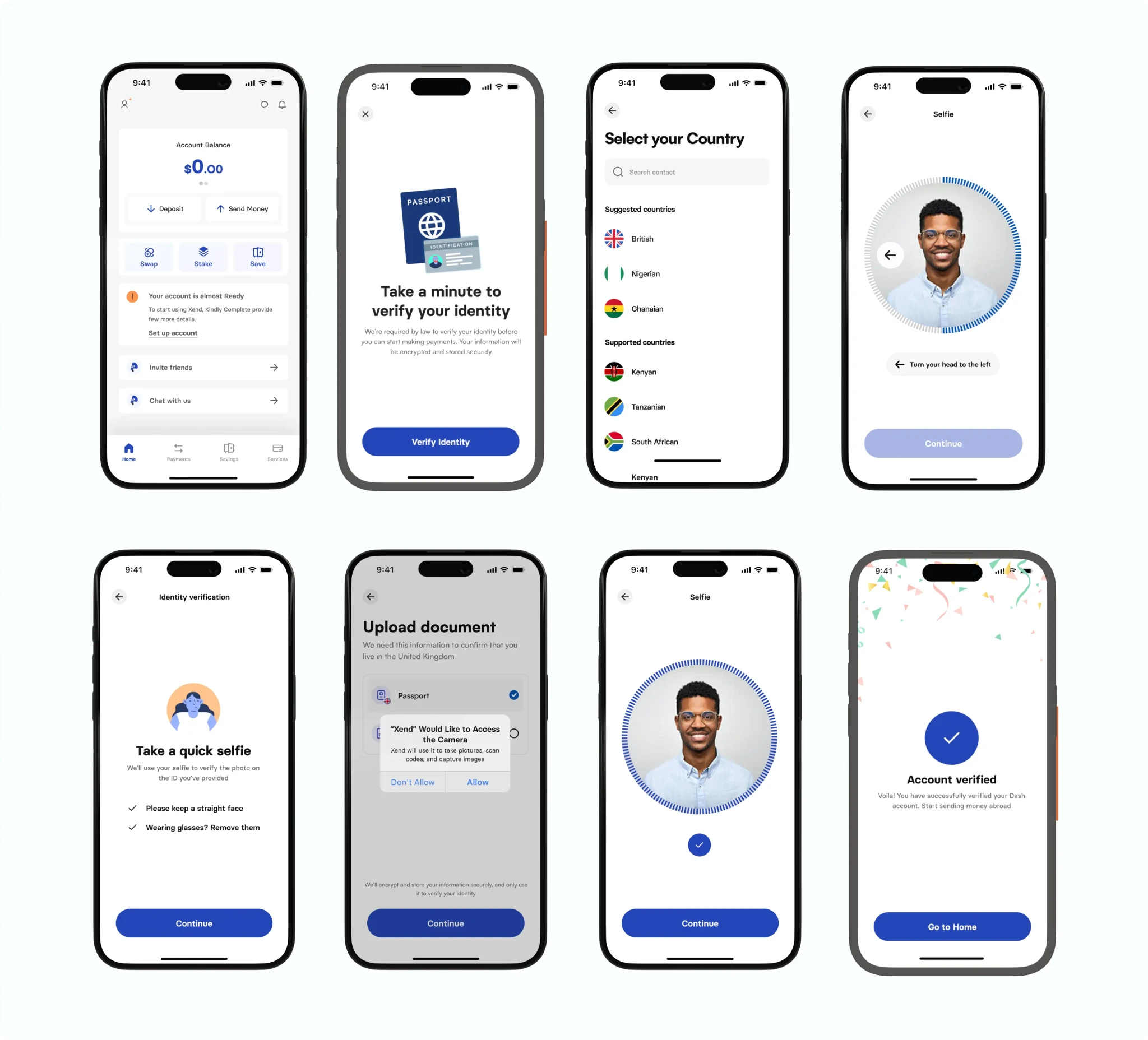
New Verification
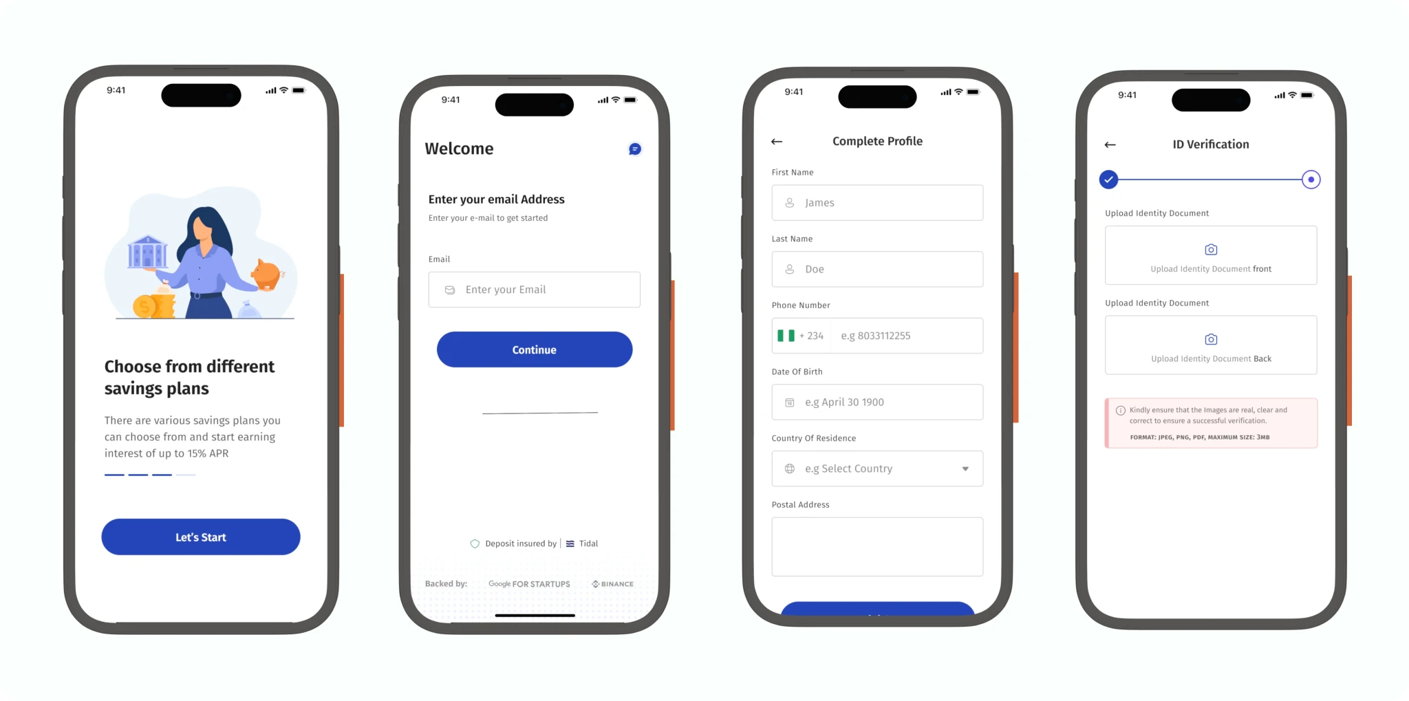
The banking and fintech sector operates under strict regulatory requirements. To ensure compliance with federal laws,
anti-money laundering (AML), and know your customer (KYC) regulations, the app implements a simplified verification process.
This approach balances regulatory needs with a smooth user experience, gathering essential information without creating unnecessary friction
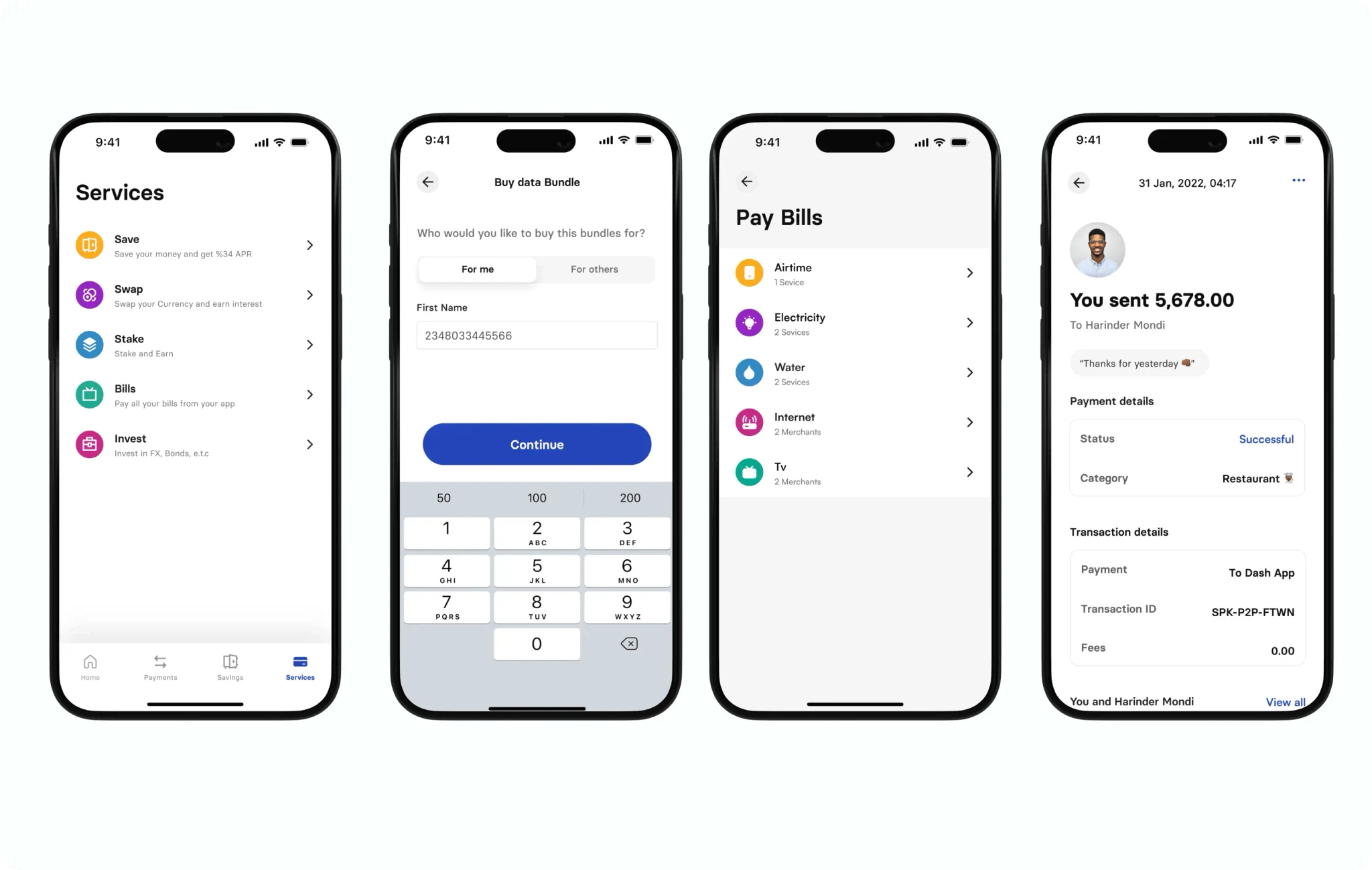
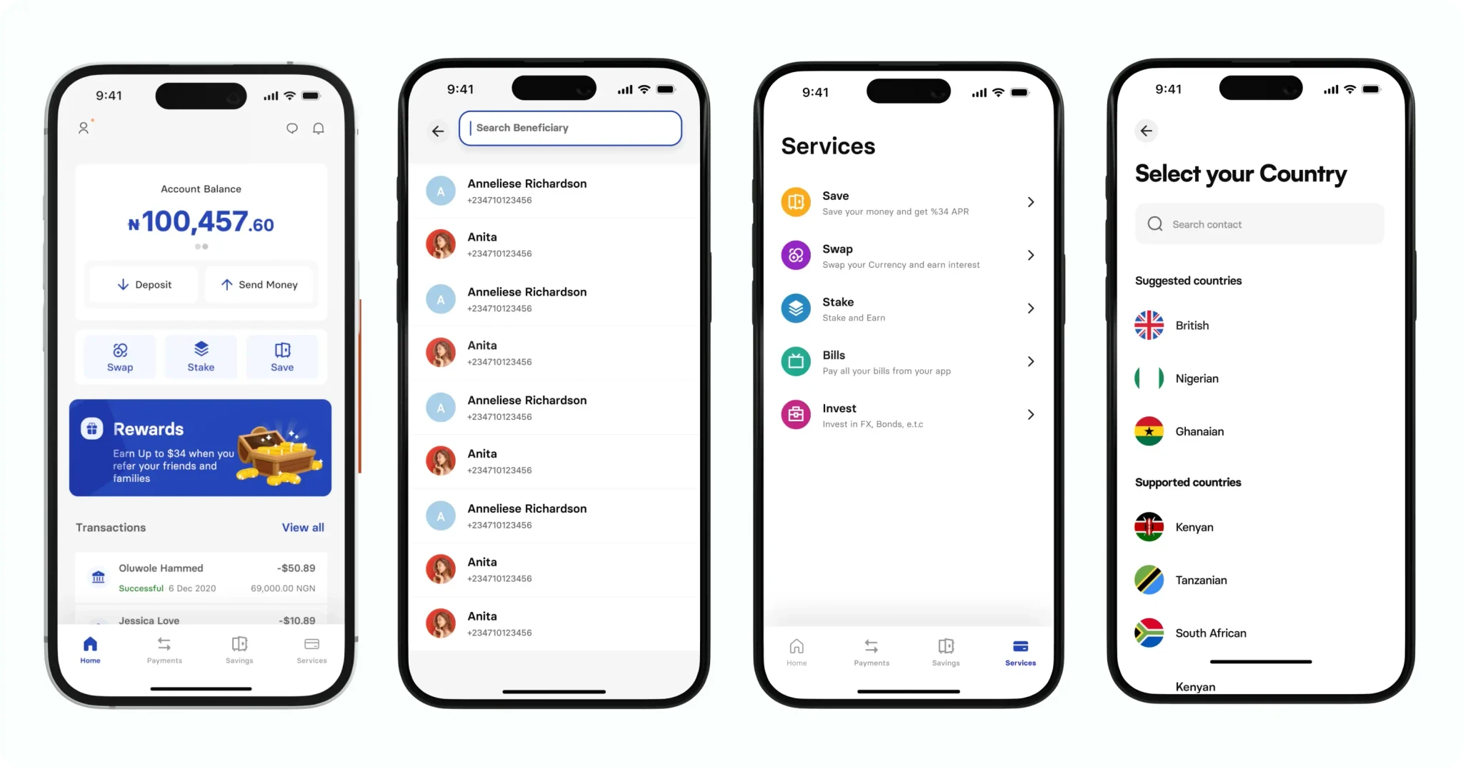
Services
We expanded our service offerings by partnering with multiple service providers, enabling users to conveniently pay for a variety of services including cable, airtime, data, and more directly within the app. Additionally, we integrated an in-app chat feature that was absent from the previous design, enhancing user communication and accessibility.