Lead Product Designer
DOME - Scalable Design System
How we create a scalable design system which reduces the design - development friction by 32%
- Timeline
- Design systems
- Reading time
- 3 min
- Sections
- 12
On this page
Background
Over time, we identified inconsistencies across our projects from UI patterns to design decisions, which led to longer design cycles, duplicated efforts, and a lack of cohesion in user experiences. Without clear guidelines or a unified structure, our design environment had become fragmented and inconsistent. Accessibility standards were often overlooked, and there was no single source of truth to anchor decisions.
The product team had essentially built a Figma file packed with legacy components and different colour styles. But to deliver impact across diverse projects and platforms, what we truly needed was a lightweight, flexible backpack, something agile enough that it is adaptable.
To address this, I led the creation of a centralised, scalable Design System to unify our workflow, increase efficiency, and improve collaboration across design and development teams.
The Problem
Despite working on several products, our internal design process suffered from:
- Inconsistent UI components across project
- Lack of reusable assets, leading to duplicated effort
- Poor handoff between design and development
- No shared documentation for standards or best practices
These gaps slowed us down and affected the quality and scalability of our digital products.
Research and Discovery
We kicked off with a discovery sprint to understand pain points:
- Designer Interviews: Highlighted inefficiencies with repeated component creation
- Developer Feedback: Noted inconsistencies in handoff specs and front-end patterns
- Audit: We audited 6+ past design files, spotting multiple versions of similar buttons, modals, and grids
Key Findings
- Every team created their own UI components, wasting time
- Developers rebuilt similar patterns repeatedly
- No version control or source of truth existed
- Onboarding new team members took longer than necessary
The Impact
Consistent UI across projects, improving brand perception.
- Faster design cycles due to reusable components
- 30%
- Reduction in design development friction with shared Figma library + documentation
- 32%
- Less time to onboard new designers
- 50%
Approach - Solution
We adopted an Atomic Design methodology and broke down our system into:
- Foundations: Colors, Typography, Grid, Icons
- Components: Buttons, Forms, Modals, Cards, etc.
- Templates: Layouts for dashboards, listings, detail pages
- We used Figma as our source of truth, ensuring shared styles, components, and libraries.
What did we ship
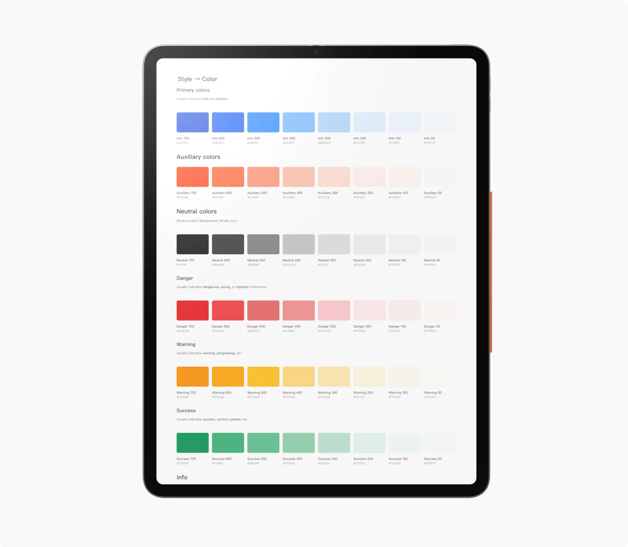
Branded colour palette: Defining the different overlapping layers and colour hierarchy
Typography
Typography properly space with enough line height
Spacing
8px spacing scale to create more consistent and responsive layouts
Next Steps
- Continuous accessibility checks for all components
- Integrate the system into our client proposals as part of delivery
- Evolve system based on feedback and new projects
- Automate sync between Figma and Storybook using plugins
Key Learnings and Takeaways
Creating a Design System wasn't just about organising components, it was about enabling better collaboration, reducing waste, and setting a scalable foundation for future growth. It became a tool for alignment, not just aesthetics.
- Design Systems are not one-size-fits-all they must grow with your team
- Early collaboration with developers is crucial to avoid design-debt
- Clear documentation is as important as beautiful components
- A good system enables creativity, not restricts it